Scatter plot showing the path of selected data points
Another week with Workout Wednesday: This is my take on the exercise for week 27/2024 which is about scatter plots with paths. The challenge is from Bernat Agullo and uses interesting open data from the website Gapminder. I found it very helpful that Bernat provided a written step-by-step guide and I later discovered his video as well. You can download my solution here.
So let’s delve in the new things from my perspective.
Join Data in Power Query
We start off with two different Queries regarding Fertility Rate and Life Expectancy. I naturally would have joined thes using the relationship view of the model but there is also an interesting way to perform joining of datasets in PowerQuery.
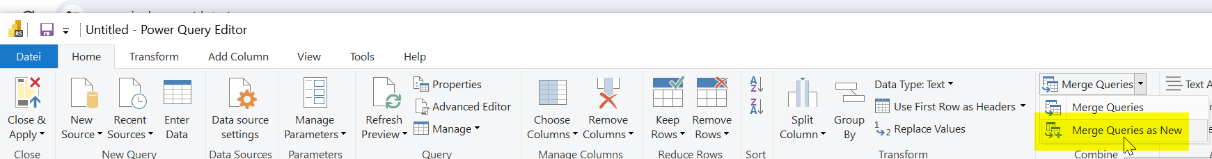
Click on “Merge Queries as New” in the “Home” Tab of Power Query Editor.
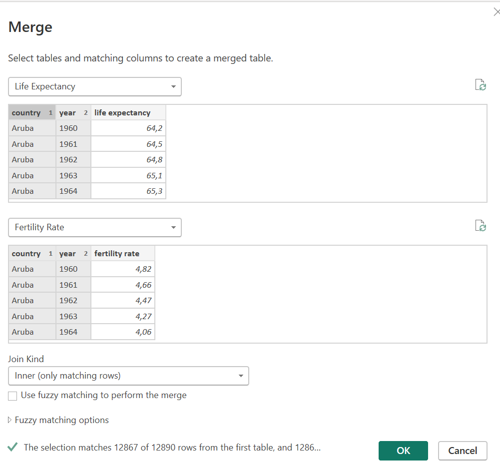
Then you can select the join columns by clicking on them and the “Join Kind”…I choose an Inner Join here.
The columns from the second table then show as “Table” so you need to expand them by clicking on the symbol behind the table name.
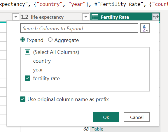
You can then create another column for “Year-Country” using the option “Add column from Examples” which worked quite well.
So in the end my Power Query looked like this
let
    Source = Table.NestedJoin(#"Life Expectancy", {"country", "year"}, #"Fertility Rate", {"country", "year"}, "Fertility Rate", JoinKind.Inner),
    #"Expanded Fertility Rate" = Table.ExpandTableColumn(Source, "Fertility Rate", {"fertility rate"}, {"fertility rate"}),
    #"Renamed Columns" = Table.RenameColumns(#"Expanded Fertility Rate",{{"country", "Country"}, {"year", "Year"}}),
    #"Inserted Merged Column" = Table.AddColumn(#"Renamed Columns", "Year-Country", each Text.Combine({[Year], "-", [Country]}), type text),
    #"Reordered Columns" = Table.ReorderColumns(#"Inserted Merged Column",{"Country", "Year", "Year-Country", "life expectancy", "fertility rate"})
in
    #"Reordered Columns"
Generating dimension data in Power Query
I choose to click on the country column and selected “Add as a new query”.
Next I needed to remove the duplicates and rename the query.
Next I repeated these steps for the Year column.
The following creation of DAX Measures has been pretty straight forward. I noted that once again it is beneficial to set color codes or reference them via DAX like last week.
Tricky DAX Measures for the Path
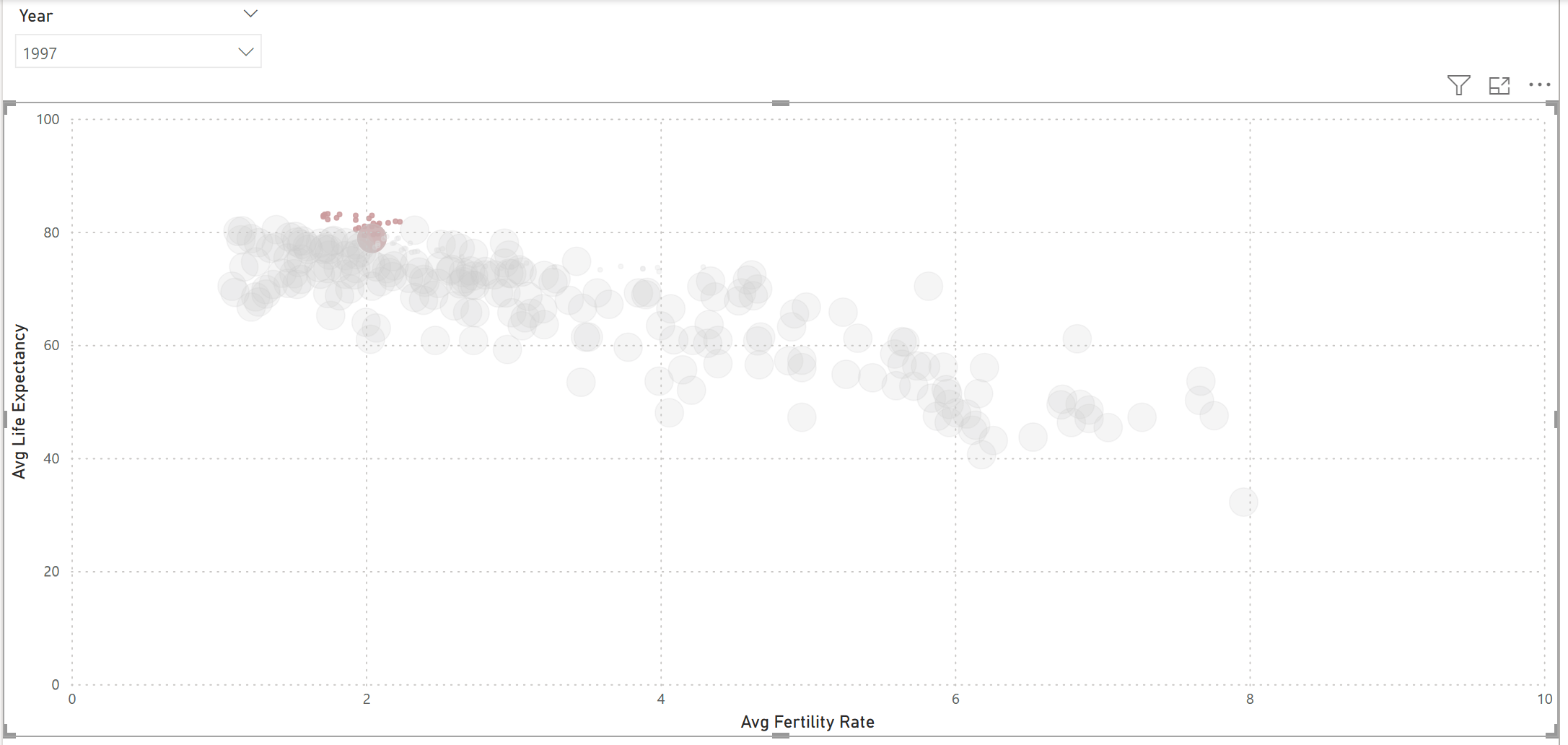
The whole exercise is about showing a path on the scatterplot for the changes over the years.
The first tricky measure for me is the “Path Size”. If the year filtered on the Year table is different than the year in the historical data table change the size. Turns out that the SELECTEDVALUE function is of help here:
Path Size =
 VAR SelectedYear = SELECTEDVALUE('Year'[Year])
 VAR HistoricYear = SELECTEDVALUE('Historical Data'[Year])
 RETURN
    IF(
            SelectedYear == HistoricYear,
            [Size],
            [Size]/100
        )
The Patch color function is pretty much the same but your are setting different color codes.
Patch Color =
VAR SelectedYear = SELECTEDVALUE('Year'[Year])
VAR HistoricYear = SELECTEDVALUE('Historical Data'[Year])
RETURN
IF(
HistoricYear >= SelectedYear,
"#F52D0C",
[Color]
)
In order to test my measure properly I did a matrix with conditional formatting based on the patch color. The path size is fine but oops… the color applies only to equals and not to greater than.
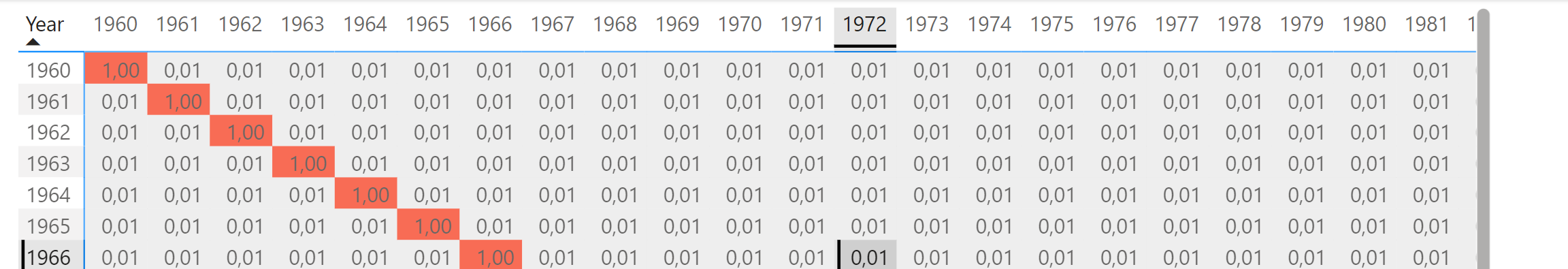
First I thought this would be related to the datatype “Text” for the year…which is not that ideal…but it was only in the video of Bernat Agullo that I found out about the reason: The year table has a relationship and is therefore filtering the fact table…I felt so dumb as I found out. I realize that I haven’t thorughly understood the filter context feature of DAX yet and it would take me much more practice…on the other hand it seems quite common to bypass filtering in a DAX measure…at least with the workouts from Workout Wednesday 😉.
So the correct measure looks like this:
Path Color =
 VAR SelectedYear = SELECTEDVALUE('Year'[Year])
 VAR HistoricYear = CALCULATE(SELECTEDVALUE('Historical Data'[Year]), REMOVEFILTERS('Year'))
 RETURN
    IF(
            HistoricYear >= SelectedYear,
            "#99393C",
            [Color]
        )
I then took the video to recreate the steps regarding calculation groups. This is a topic I need to learn about more fundamentals as well.
Despite the video instruction it took me a bit of fiddling to put the two scatterplots over each other.
Final thoughts
This was again an interesting excercise combining Power Query and DAX parts. I enjoyed the Power Query part but have to admit that I still struggle to come up with the correct DAX measures myself. On the other hand it proves as a good training as I stumble across these areas and then are able to learn the fundamentals about these techniques.