Theme Sentiment Colours with Power BI
WoW 2024_26
Today I worked on my first submission to Workout Wednesday. Okay it’s technically Thursday here in Germany but more important I managed to do the whole thing.
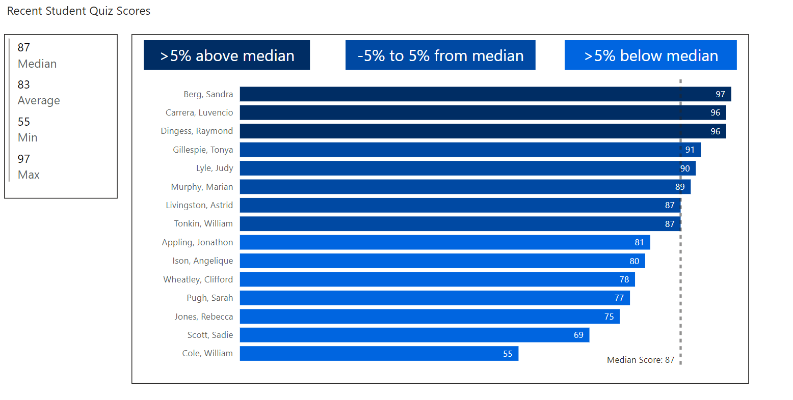
I chose week 26 which is about Reference Theme Sentiment Colors in DAX and practiced how to design a dashboard in a way where color scheme changes are reflected automatically in the formatting of the visual.
I would like to share my personal learnings in a short bullet point list. This is mainly for myself as a reference but maybe it proves valuable to you as well.
First of all go ahead and grab my pbix here:WoW_2024_26_Theme Sentiment Colors_Guth.pbix
To be honest I am quite ashamed to need to put it on One Drive 😳. It seems that you need a Power BI Pro License for publishing in the service for others to view (correct me if I am wrong). And even fiddling around with wordpress to allow the upload into the blog was too much for me in the early evening.
Anyway…there we go
Lessons learned:
DAX Measures
- Median Score
- Started with
MEDIAN(data[Test Score]) - Unfortunately this is no good, if you have the student as filter context….there is only one row so the median ehem is always the same as the Test Score
- Then asked copilot how to do it who came up with a very convoluted approach basically reinventing the MEDIAN calculation logic…really?
- Started with

I then had a look at https://community.fabric.microsoft.com/t5/Desktop/Make-measure-ignore-specific-filter/m-p/336870 and found a simple answer: CALCULATE(MEDIAN(data[Test Score]), ALL())
Adding the trendline for the median: You need to rename the line first…then choose “Both” in the “Style” property for the data label
- Conditional Formatting with DAX
- Thanks to Copilot this also was not too complicated but still tricky in the details.
- I used a SWITCH command in the end and first of all wondered what the first parameter is about (TRUE/FALSE)….yes I am a very beginner with DAX…you can change the behaviour for the conditions to evaluate to true or to false….
- IMHO at first glance this is a bit academic as you could always write the switch conditions the other way around…but there might be practical use cases…let me know if you have one
Variance Color = SWITCH(
TRUE ,
[Score Variance from Median (%)]> 5,
“good”,
[Score Variance from Median (%)] >= -5 && [Score Variance from Median (%)] <= 5,
“neutral”,
[Score Variance from Median (%)] < -5,
“bad”
)
It turns out that the color names are case sensitive. I once tried to use “Good” instead of “good” which didn’t work.
Trend Lines
You need to rename the trend line first and then are able to choose the Style both for the data label to show the name and value.

Legend
Turned out that for the legend I needed some more dax measures to set up conditional formatting.
These simply had the values “good”, “neutral” and “bad”.
It works but I was a bit disappointed that the conditional formatting dialogue itself cannot point to the style colours itself.
Colors
The colors I choose might look odd to you? Well ok there you go.
I wanted to start with #002D64 and then choose the same color with different tint.
I have just recently learned more about colors and accessibility from the great Elena Drakul(evska) at SQL Saturday Rheinland. She has a great blog post on colors…check that out.
So I had a funny time geeking out on colors and accessiblity and thereby learning that the colour schemas Microsoft Power BI calls “accessible” are actually not WCAG 2.1 AA compatible (at least not for text below 17 pt which typically data labels are).
Would I call myself a UI Pro? Definitely not but I try to learn…therefore I also used whitespace deliberately and drew boxes around my dashboard elements.
The next challenge
Well that’s all for this week folks but I pledge to do more Workout Wednesday sessions. I really appreciate the setting…giving a task and then letting people figure out how to do that. The excercises are manageable but still for me as a new learner in Power BI there is often much to explore and you look on one setting…start to read about it or experiment with it and well…time flies. I started 3 hours ago…this writeup took me 1 hour and the excercise itself 2 hours…much to improve regarding effectiveness…but you know we all learn each day, right?
Thanks for reading…leave a comment if you found something valueable in this writeup 😉.