
(Failed) Remake of a Tableau Segmented Bar Chart
I tried to do the Workout Wednesday Exercise of week 29 but oh boy…this was far to difficult for me.
Here’s the PBIX of the failed solution and finally the PBIX of the follow-along-successful solution 😉.
Failed approach
Data prep and DAX measures I thought were straightforward. I ended up creating a measure for sales for each year and a measure for total sales…sure there are more elegant ways to have this more generic and not have to create a measure each year but I didn’t immediately know how to do this. Here’s an example:
Sales2021 := CALCULATE(SUM(Orders[Sales]), FILTER(Orders, YEAR(Orders[Order Date]) = 2021))
But the main challenge is to come up with that wonderful bar chart…showing the total of all year, as well as the years segmented below.
I looked into deneb and the getting started guide but this soon got too much for me…nothing to accomplish in one hours time with no basic knowledge how the syntax works. A web search didn’t yield anything right of use. Unfortunately the video for the challenge has a non-functional link.
Then I spent some time recreating the recipe from this youtube video:
This basically involves introducing a new table NewAxis labelling the two different axes and then displaying the total value only if the total axis is selected and the year values vice versa only if the year axis is shown.
However all this effort just to find out: While it works for column charts like this (excuse the vanilla viz styling)
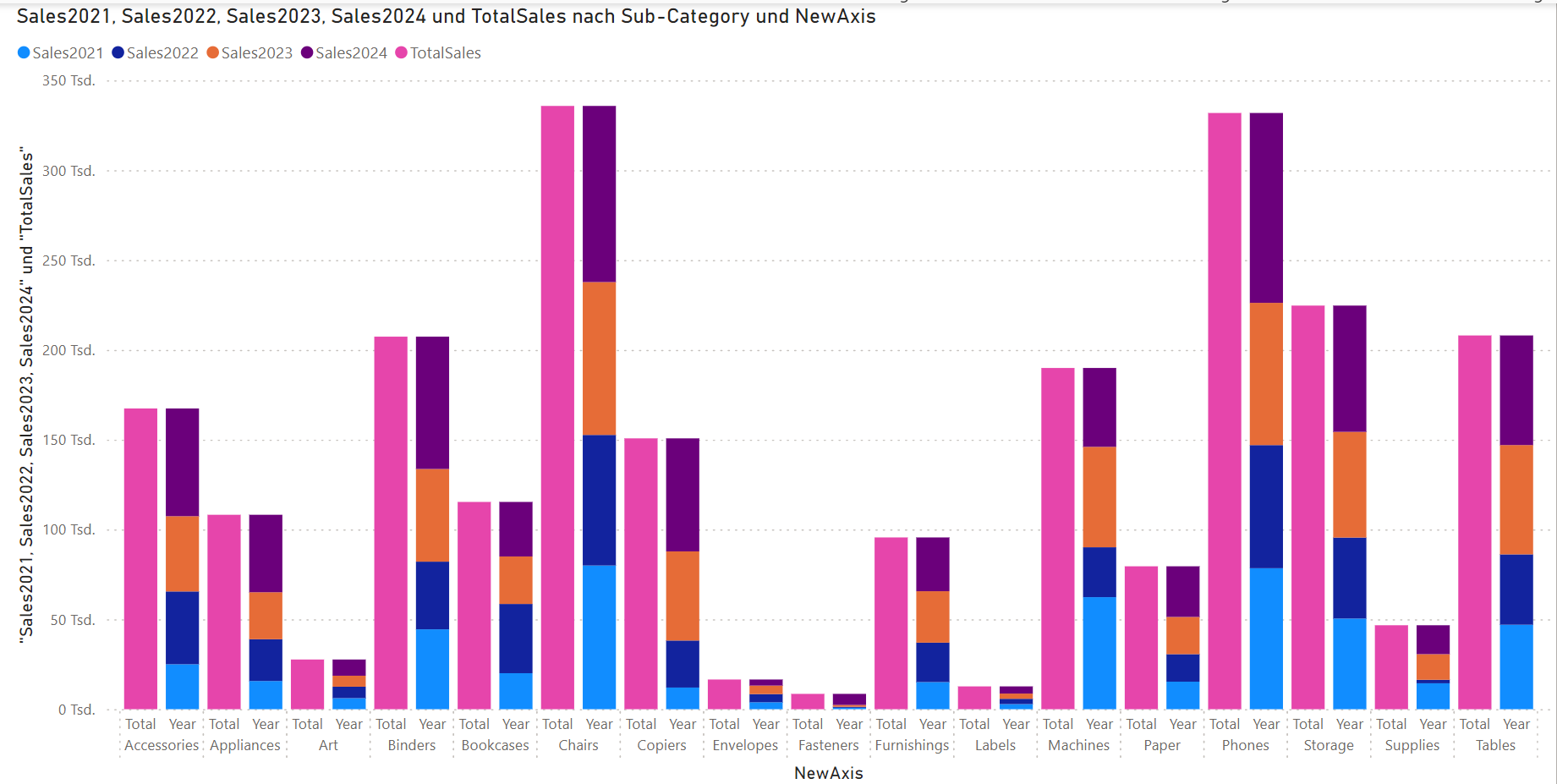
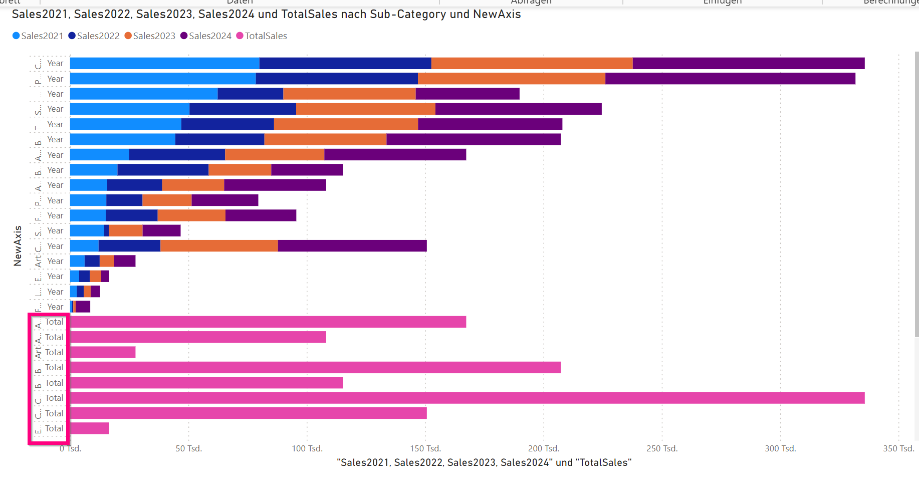
it is of less use in a clustered bar chart as the “total” axis gets sorted down at the bottom:
So unfortunately not much of success this week and just a blog post to document what is NOT working in this scenario.
I will definitely review Meagan’s video as soon as it is published and I find the time to learn more….however this challenge was too hard for me as a beginner with the amount of instruction available.
Successful completion following along Meagan’s Video
Meagan Longoria published a walkthrough video of the solution
I learned from the following differences to my solution
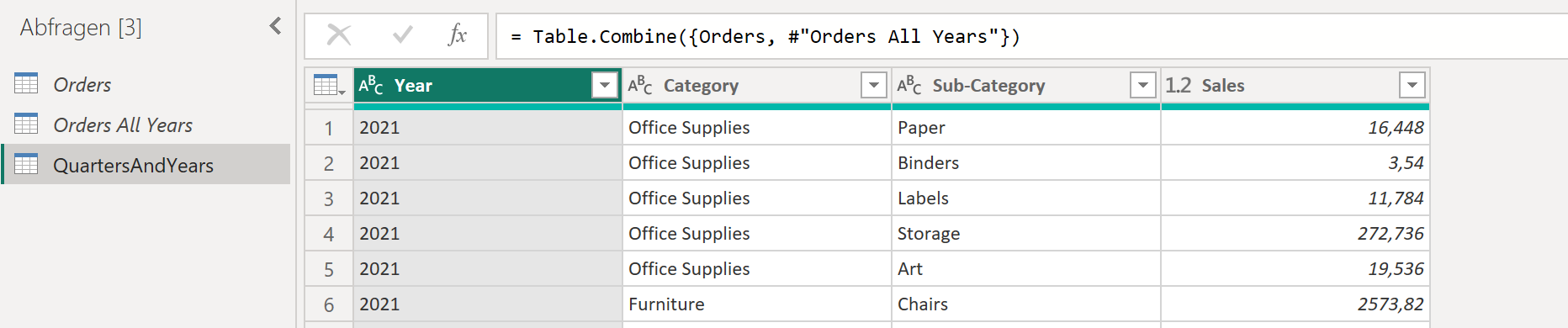
Data preparation
Meagan chose to prepare the data with Power Query so that the model fits the purpose well. Neat idea I haven’t thought of! Thus the model size itself is kept much smaller than importing the whole orders table just to aggregate later on it. On the other hand (as she states in the video as well) this might not be applicable in a business scenario where you operate on a data model you would like to use for other reports and dashboards as well.
Measures
As a best practice the Measures are organized in a blank table, created via New Table
_Measures = {BLANK()}
Meagan starts with three measures:
- A base measure for the Sum of Sales
Sales Amt := SUM(QuartersAndYears[Sales]) - A measure filtering the sales by year by ignoring the “All” Value in the Year-Column
Sales By Year := CALCULATE([Sales Amt], FILTER(QuartersAndYears, QuartersAndYears[Year] <> "All")) - A measure filtering the sales for all years (opposite of the second measure)
Sales - All Years := CALCULATE([Sales Amt], FILTER(QuartersAndYears, QuartersAndYears[Year] = "All"))
Seems that once you get the knack of how to manipulate filter context with the CALCULATE function it’s not that mysterious any more….three weeks ago I really struggled with this…however there’s still more about it to learn (my current read is The Definitive Guide to DAX by SQLBI).
Deneb VegaLite Magic
I haven’t really started learning VegaLite yet, which is used inside the Deneb visual.
So this part is mainly retyping me what I see on screen. To save you from doing that as well…here’s the VegaLite JSON Config:
{
  "data": {
    "name": "dataset"
    },
    "padding": "auto",
    "transform":[
      {
      "fold":[
        "Sales - All Years",
        "Sales By Year"
      ]
      }
    ],
  "spacing":{"row": 1},
  "facet":{
    "row": {
      "field": "Sub-Category",
      "type": "nominal",
      "header": {
        "labelAngle":0,
        "title":"",
        "labelAlign":"left",
        "labelAnchor": "middle",
        "labelBaseline":"bottom",
        "labelOrient": "left",
        "labelPadding":35,
        "labelFontSize":14
      } ,
      "sort": {
        "field":"Sales Sales - All Years",
        "order":"descending"
      }
    }
  },
  "spec":{
    "width": 1000,
    "height":{"step": 15},
    "mark":{
      "type": "bar",
      "tooltip":true,
      "size": {"expr": "if(datum.key == 'Sales By Year', 10,18)"},
      "stroke": "white",
      "strokeWidth": 2
    },
    "encoding": {
      "y":{
        "field": "key",
        "type": "nominal",
        "title" : null,
        "axis": null,
        "scale": {
          "paddingOuter": 0,
          "paddingInner": 0
        }
      },
      "x":{
        "field":"value",
        "type": "quantitative",
        "tickCount": 5,
        "axis": null
      },
      "color":{
        "field":"Year",
        "type": "nominal",
        "legend":null,
        "scale": {"range":[
          "#c77381",
          "#c77381",
          "#c77381",
          "#c77381",
          "#c77381"
        ]
        }
      },
      "order": {"field": "Year"}
    }
  }
}
Megan pointed out following things:
- The fold-Transformation (the line 8-11) is needed to get the two measures into one chart.
- Faceting (line 15-34 is working like small multiples for the subcategory (so 1 combined chart per each subcategory)
- The Spacing element (line 14) is needed to have just a small space between categories (the default is much wider)
- The “type”:”nominal” refers to text and descriptions
- Subcategories are sorted descending by sales (line 29-31)
- The mark definition (line 38 following) defines the barchart
- The size expressions does the trick of totals being 18 pixels wide while as year values are only 10 pixels.
- Dividers are configured by the stroke settings in line 42 and 43
- The encoding definition lists the field used
- from folding we get two entries: Key (name of the measure), value (of the measure)
- The y axis uses the key (here subcategories)
- The x axis features the value (quantitative sales amount)
- color is the same for each year…the easiest way is defining the range and inserting as many values as we have years
- from folding we get two entries: Key (name of the measure), value (of the measure)
- Last but not least we order the year bars by year
The bars are by default shown with gray lines around. Meagan points out that you can override that in the config section by the following Vega Lite:
{ "view":{"stroke":"transparent"} }
Tooltips
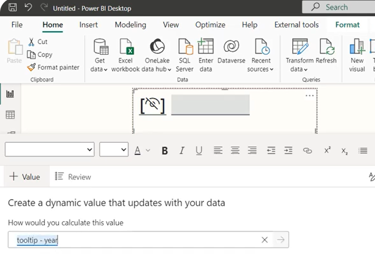
Next Meagan creates another page for a tooltip.
This needs a couple of more DAX measures.
Tooltip - Year :=
    VAR yr  = SELECTEDVALUE(QuartersAndYears[Year])
    VAR result = IF(yr = "All", "", "| " &yr)
    RETURN result

Tooltip - Subcategory := SELECTEDVALUE(QuartersAndYears[Sub-Category])
Use then a new textbox and add the value like this:
This is the first time that I have seen this technique of referencing values from a textbox…I do that quite often in Cubeware Cockpit but haven’t done it in Power BI so far…Knew that it would exist and bingo…there you go 😉.
Patrick from Guy in a cube has a done a nice walkthrough of that functionality:
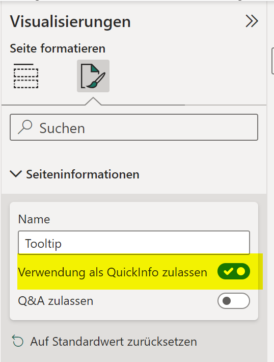
First I failed to assign the page as a “quick info” and then discovered that this is an option that I had to activate in the page options:
So here’s a link to my final pbix if you are interested.
Further Learning about VegaLite and Deneb
Deneb with VegaLite looks like a great way to customize visuals and to work around restrictions in Power BI core visuals. However I am still a newbee to it.
Here’s what Meagan recommended as learning resources:
- Official Introduction to VegaLite
- Youtube Video “Getting started with Deneb” by Ben Ferry
- Blog Posts by Imran Haq
- Blog Posts by Kerry Kolosko
And here are quite intreaguing galleries with examples
- VegaLite Example Gallery
- VegaLite Templates by Ben Ferry
- Deneb Templates by Kerry Kolosko
- Deneb Templates by PowerBI Tips
A big thanks to Meagan Longoria for the help and the video…this blog post would be much less valuable without her expertise…I am merely giving a summary of her work and still learning these things.